Paste HTML to embed in website

inward migration

A total of 11,260,336 working residents in the UK commuted from one local authority to another for work. But, how far do people commute to work? Which local authorities have a higher number of people out-commuting to work elsewhere? Where do the residents in my local authority work, and where does the working population in my local authority live?

Find out this and more with these interactive maps.

The 406 local authorities in England, Northern Ireland, Scotland, and Wales are shown in the map on the right.

You can see that we have marked 3 extremely different cases - a local authority with:

  • A high number of net-commuters (in-commuters minus out-commuters)
  • A low number of net-commuters
  • Similar number of workers in-commuting and out-commuting to/from it.
Hover over the areas to see which is which.

Skip introduction

Increase or decrease?

Does your areas population increase or decrease because of commuting patterns? The map highlights (in blue) the local authorities that have more in-commuters than out-commuters; that is: more people coming to work in that area than leave to work elsewhere.

Skip introduction

Out-commuters

What proportion of the workers living in your local authority work in your local authority, and what proportion commute out to a different local authority?

The map currently highlights (in blue) the areas where over 50 per cent of workers commute out to work. Use the slider to change the threshold.

The share of out-commuters is defined as the number of out-commuters in a local authority divided by the total number of residents (who are in employment) in that local authority. For example, here is a breakdown for East Renfrewshire (Scotland). You can see that 66% of the resident population commute out of the area.
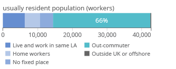
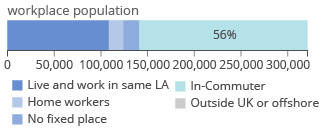
Skip introduction

In-commuters

The map on the right highlights the local authorities with highest share of in-commuters. Use the slider to change the threshold.

The people that work in a local authority are its workplace population. The share of in-commuters is defined as the number of in-commuters in a local authority divided by its workplace population. For example, 56% of the workplace population in Manchester commute in from different local authorities.

Skip introduction

The London magnet

The map now shows the share of working residents in each local authority that work in Greater London. There are 19 local authorities were over 20% of working residents commute to London, a further 23 local authorities have over 10% of working residents commuting to London and 21 more local authorities have between 5%-10% of working residents commuting to London. Greater London

We can also switch to look at the share of working residents in each local authority that work in Inner London. There are 21 local authorities were over 20% of working residents commute to Inner London, and 3 of them are outside of Outer London: Epping Forest (East of England), Brentwood (East of England), and Elmbridge (South East).

Skip introduction

Time for you to go to work

The local authorities with more than 70% of in-commuters in their workforce are all in Inner London. For example, 79% of the workplace population in Tower Hamlets commute in from different local authorities; the map on the right shows where these workers live. Once you close this introduction you can use the interactive map to explore commuting patterns in more detail for your area.

The areas highlighted in red show the significant relationships for the area - significant given the distribution of values for the area, using a method adapted from Holmes and Haggett (1977).

Close
See more by the ONS Data Visualisation Centre
Source & data: ONS, Internal Migration Estimates

For a safer, faster, better experience online you should upgrade your browser. You will then be able to play with lovely interactive graphics such as this one.

Find out more about browsers

Thumbnail